


Pill Sorter
Pill Sorter
Meal prep your pills
Meal prep your pills
Introduction
My mum takes multiple supplements. Meaning she has to open, pour, and shut several different containers every day. Pill sorters aim to fix this, providing one container that stores a week of pills sorted by day.
However, the existing products are space inefficient, lack durability, and often spill pill when travelling.
Solution
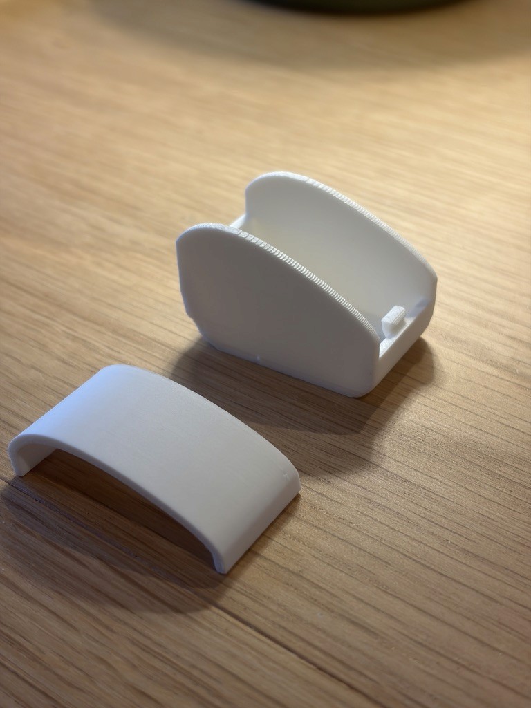
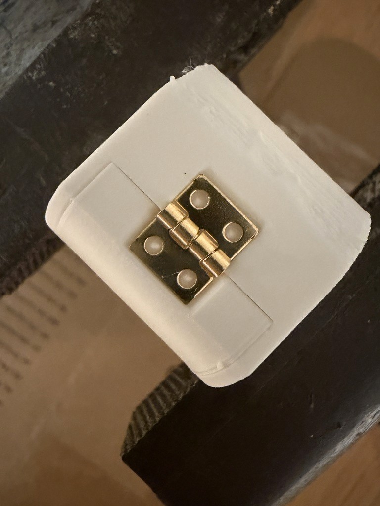
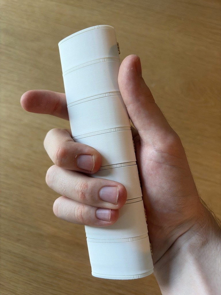
I designed a solution that is single walled for efficiency. Has individual metal hinges for each lid to provide durability. Instead of protruding lips for opening the lid, I made recesses so no accidental opening would occur in your bag. The shape fits nicely in your hand for comfortable use.
Process
I worked in 3 stages. Firstly analysing the problems and criteria. Looking at examples of existing pill sorters and talking to the client, my mum.
Next I designed the body, chose a snap shut mechanism and metal hinge.
Finally was manufacturing, assembly and iteration to get it just right.



Introduction
My mum takes multiple supplements. Meaning she has to open, pour, and shut several different containers every day. Pill sorters aim to fix this, providing one container that stores a week of pills sorted by day.
However, the existing products are space inefficient, lack durability, and often spill pill when travelling.
Process
I worked in 3 stages. Firstly analysing the problems and criteria. Looking at examples of existing pill sorters and talking to the client, my mum.
Next I designed the body, chose a snap shut mechanism and metal hinge.
Finally was manufacturing, assembly and iteration to get it just right.
Solution
I designed a solution that is single walled for efficiency. Has individual metal hinges for each lid to provide durability. Instead of protruding lips for opening the lid, I made recesses so no accidental opening would occur in your bag. The shape fits nicely in your hand for comfortable use.
Whisky packaging
Whisky packaging
Reusable, luxury whisky packaging
Reusable, luxury whisky packaging
Introduction
Upcoming Packaging and Packaging Waste Regulations (PPWR) dictate that packaging must be reusable, recyclable or compostable. Each group was tasked to design whisky packaging that maintained luxury while upholding the regulations.
Solution
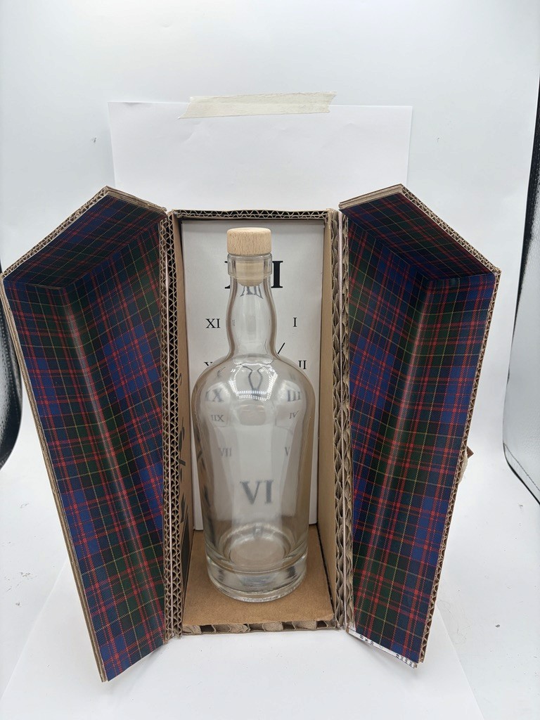
We designed a limited edition Hogmanay (New years eve.) pack (package) that you reuse as a clock.
The pack opens with a retro hasp latch. Then opens with decorative, diagonal piano hinges, beautifully framing the bottle. As you remove the bottle the spring hinge rotates the clock into position, stopped by a latch. This latch can be rotated to further lift the clock and replace its batteries.
The pack's body would be made of laser cut walnut. It would have a navy velvet interior. Silver accent hinges and latches.
Process
As a group we started with research. We looked into the luxury whisky market, looking at themes and countries. We made some initial concepts based off this. We picked the theme of traditional Scottish because of our location and connection.
We furthered our research into the user, materials, and forms. We developed some concepts, yet wanted to make reusable packaging. We settled on time as our theme for reuse, based on the First Footing tradition which occurs at New Year Eve.
From there we developed our first prototype based on a clock in a box we had found.
After some refinements to the design we made the real thing. Choosing a wooden box with navy velvet interior.




Introduction
Upcoming Packaging and Packaging Waste Regulations (PPWR) dictate that packaging must be reusable, recyclable or compostable. Each group was tasked to design whisky packaging that maintained luxury while upholding the regulations.
Process
As a group we started with research. We looked into the luxury whisky market, looking at themes and countries. We made some initial concepts based off this. We picked the theme of traditional Scottish because of our location and connection.
We furthered our research into the user, materials, and forms. We developed some concepts, yet wanted to make reusable packaging. We settled on time as our theme for reuse, based on the First Footing tradition which occurs at New Year Eve.
From there we developed our first prototype based on a clock in a box we had found.
After some refinements to the design we made the real thing. Choosing a wooden box with navy velvet interior.
Solution
We designed a limited edition Hogmanay (New years eve.) pack (package) that you reuse as a clock.
The pack opens with a retro hasp latch. Then opens with decorative, diagonal piano hinges, beautifully framing the bottle. As you remove the bottle the spring hinge rotates the clock into position, stopped by a latch. This latch can be rotated to further lift the clock and replace its batteries.
The pack's body would be made of laser cut walnut. It would have a navy velvet interior. Silver accent hinges and latches.
Fix a Friend
Fix a Friend
Storage boat
Storage boat
Introduction
You are paired up with a colleague and redesign a product they find frustrating, while in their style. I redesigned a communal storage bowl. This sat on his coffee table in the living room. Used for quickly grabbing and storing general items such as: keys, pens / pencils, tape measure, cards and more.
The problem he had was that the bowl was unorganised; Losing small items; and lacking a place for his keys.
Solution
I created a catamaran inspired storage boat. It has a hook as the sail to hold keys; trays on both sides to hold pens and pencils; general storage front and back for cards, tape measure, etc.; a hidden storage in the boats interior for smaller items likes coins; and space underneath for papers.
Process
I started by talking to my colleague, understanding their issues and requirements for the product. I also got to know my colleague and their hobby for sailing. With this I came up with my concept for a catamaran inspired storage boat. I then created the first prototype and got confirmation for the direction. Then I developed the form and features, creating my final prototype.
Introduction
You are paired up with a colleague and redesign a product they find frustrating, while in their style. I redesigned a communal storage bowl. This sat on his coffee table in the living room. Used for quickly grabbing and storing general items such as: keys, pens / pencils, tape measure, cards and more.
The problem he had was that the bowl was unorganised; Losing small items; and lacking a place for his keys.
Process
I started by talking to my colleague, understanding their issues and requirements for the product. I also got to know my colleague and their hobby for sailing. With this I came up with my concept for a catamaran inspired storage boat. I then created the first prototype and got confirmation for the direction. Then I developed the form and features, creating my final prototype.
Solution
I created a catamaran inspired storage boat. It has a hook as the sail to hold keys; trays on both sides to hold pens and pencils; general storage front and back for cards, tape measure, etc.; a hidden storage in the boats interior for smaller items likes coins; and space underneath for papers.
House on a Rock
House on a Rock
Brand & book cover
Brand & book cover

Introduction
Creating a brand for House on a Rock Publishing. Designing a book cover for "What neurodivergent clients want their therapists to know".
I was given the name, and brand concept of a house on a rock. Based on the biblical idea of God being our Rock and foundation.
Solution
The brand uses soft saturated primary colours to grab attention but remain calm. The logo mark highlights the rock symbol. The book cover uses simple nature illustrations and a calming balance of colours.
Process
After getting the brief, I began researching the formatting and publishing to guide my designs. I mocked up some colours and potential logo formats which the client liked. Then I iterated on the logo mark, wanting to emphasise the rock symbol. After that I developed the colours and found inspiration for the book cover. Then I began creating the book cover, going through a few versions before coming to the final results.
Introduction
Creating a brand for House on a Rock Publishing. Designing a book cover for "What neurodivergent clients want their therapists to know".
I was given the name, and brand concept of a house on a rock. Based on the biblical idea of God being our Rock and foundation.
Process
After getting the brief, I began researching the formatting and publishing to guide my designs. I mocked up some colours and potential logo formats which the client liked. Then I iterated on the logo mark, wanting to emphasise the rock symbol. After that I developed the colours and found inspiration for the book cover. Then I began creating the book cover, going through a few versions before coming to the final results.
Solution
The brand uses soft saturated primary colours to grab attention but remain calm. The logo mark highlights the rock symbol. The book cover uses simple nature illustrations and a calming balance of colours.
Senses
Senses
Weighted lap toy
Weighted lap toy
Introduction
Touch was the sense I was given. I researched related problems, both in person and online. Then picked which problem to take forward and design a solution for.
Solution
My solution for overwhelming kids toys is a weighted lap toy. It mimics real world mechanisms, in hope to familiarise public settings. It uses calming blues, greens, and wooden tones. The weighted aspect provides comfort during play, helping concentration.
Process
I started with in person research, going around different stores looking for problems related to touch. Then followed up with online research. Collating all my problems together. I went with how overwhelming kids toys can be, especially for neurodivergent children. From this I diverged, coming up with several solutions to this problem. Then picking weighted lap toy due to the prevalence of sensory difficulties. Following up by mocking up a quick prototype.
Introduction
Touch was the sense I was given. I researched related problems, both in person and online. Then picked which problem to take forward and design a solution for.
Process
I started with in person research, going around different stores looking for problems related to touch. Then followed up with online research. Collating all my problems together. I went with how overwhelming kids toys can be, especially for neurodivergent children. From this I diverged, coming up with several solutions to this problem. Then picking weighted lap toy due to the prevalence of sensory difficulties. Following up by mocking up a quick prototype.
Solution
My solution for overwhelming kids toys is a weighted lap toy. It mimics real world mechanisms, in hope to familiarise public settings. It uses calming blues, greens, and wooden tones. The weighted aspect provides comfort during play, helping concentration.
Hybrid Huskies
Hybrid Huskies
Hybrid training club
Hybrid training club
Introduction
Designing a logo for a university hybrid training club. Starting from the idea for the club, and helping develop the branding.
My client wanted the logo to be minimalistic; represent the university; and follow along the lines of his inspirations from Hyrox & LDN 404.
Solution
The logo came out well, with a minimalistic letter mark that is abstract but readable. Other results were locking down the name and creating some slogans for the marketing.
Process
I began by understanding the clients goals. Ideating on the brand name and potential marketing slogans. I created a mood board to help my client find a direction they liked. Focusing on potential symbols and icons for the logo. Next I created a minimalist logo concept using just squares and triangles. Followed by other logo concepts and another mood board. After talking with the client we settled on a direction. Inspired by one logo mark and the shape method I had been using. I created multiple colourways of the logo so my client could pick their favourite .
Introduction
Designing a logo for a university hybrid training club. Starting from the idea for the club, and helping develop the branding.
My client wanted the logo to be minimalistic; represent the university; and follow along the lines of his inspirations from Hyrox & LDN 404.
Process
I began by understanding the clients goals. Ideating on the brand name and potential marketing slogans. I created a mood board to help my client find a direction they liked. Focusing on potential symbols and icons for the logo. Next I created a minimalist logo concept using just squares and triangles. Followed by other logo concepts and another mood board. After talking with the client we settled on a direction. Inspired by one logo mark and the shape method I had been using. I created multiple colourways of the logo so my client could pick their favourite .
Solution
The logo came out well, with a minimalistic letter mark that is abstract but readable. Other results were locking down the name and creating some slogans for the marketing.
ACT Design
ACT Design
Logo mark & branding
Updated Branding
Introduction
Update the companies branding. Keeping the human centred aspect from the previous version. While creating something more professional and flexible. Paying attention to design a simple logo mark.
Solution
I ended up with multiple logo variations. A consistent letter mark that has people right in the centre of it (literally). Alongside the updated fonts it feels sharp, modern, and yet open, and calm.
Process
I started by laying out the goals and breaking down what worked and didn't of the previous branding. I created a mood board to pin down what I was looking for. I wanted to create a sense of openness, people centred, and avoid a corporate flatness, leaning into imperfections. I spent time updating the fonts, choosing a more decorative heading font, while using lower weights for the body and subheadings. I then created another mood board for the logo mark. Finding inspiration in creating a logo using shapes that represent the brand. I choose triangles for a sense of direction and circles to pair and make a person icon. Then spent time developing letters with these shapes for A, C & T. I iterated a lot, and when I got closer I consolidated the letters by making sure they all fit in a square profile.
Introduction
Update the companies branding. Keeping the human centred aspect from the previous version. While creating something more professional and flexible. Paying attention to design a simple logo mark.
Process
I started by laying out the goals and breaking down what worked and didn't of the previous branding. I created a mood board to pin down what I was looking for. I wanted to create a sense of openness, people centred, and avoid a corporate flatness, leaning into imperfections. I spent time updating the fonts, choosing a more decorative heading font, while using lower weights for the body and subheadings. I then created another mood board for the logo mark. Finding inspiration in creating a logo using shapes that represent the brand. I choose triangles for a sense of direction and circles to pair and make a person icon. Then spent time developing letters with these shapes for A, C & T. I iterated a lot, and when I got closer I consolidated the letters by making sure they all fit in a square profile.
Solution
I ended up with multiple logo variations. A consistent letter mark that has people right in the centre of it (literally). Alongside the updated fonts it feels sharp, modern, and yet open, and calm.
Smaller projects
Smaller projects
Products & more


TV remote stand
Introduction: Upgrade my TV Remote stand.
Process: Fixed problems from my previous design. Added extras for a better look and function.
Solution: The remotes are angled for easy grabbing. A lip prevent falling out. The aluminium rods add weight to prevent tipping. Rubber and cork add grip for the remotes and base.

Sunglasses tray
Brief: Creating an organised, aesthetic place to store my 4 pairs of sunglasses.
Solution: My design was inspired by the asymmetry and curves of the classic Dualit toaster. I added a lip for the edge of the lens for stability.
Status: This version is finished. In the future I could improve the protection for the lenses, potentially with fabric.

Advertising
Brief: Updating marketing templates for Acorn to Oak Education.
Process: I combined my inspiration from Van De Graf's page construction with the existing templates.
Solution: The frame guides the readers eyes. Several colourways add variation. Webinars have photos and regular posts, solid background for distinction.

Madrid Magnets
Brief: Create a multi use fridge magnet based on our trip to Madrid design festival 2026
Process: I gathered inspirations and focussed on the brand LOEWE and scent which peaked my interest.
Solution: The back has the magnets. The inside has cotton balls with scent oil on. The front has screws for refilling and vents to diffuse scent.

Gratia Sans

Brief: Create a font loosely based around my handwriting style.
Process: I explored the software options. Settling with a dedicated software called font forge. Then I started designing the letters, one at a time and iterating till I was happy.
Solution: I ended up with a soft consistent font, that would work great in a children's book.
What we do
What we do
& Who we are
Client based Identity design
Logos
Branding
Websites
Book covers
Marketing templates
In house Product Design
Homewares
Storage
Organisation
Accessibility
Values
Accessibility
Helping people
Human centred design
Long lasting & high quality

Contact
Contact
Email us about enquiries
Email us about enquiries
Contact information
Email: actdesigncompany@gmail.com
Instagram: @actdesigncompany
Linkedin: tbc.